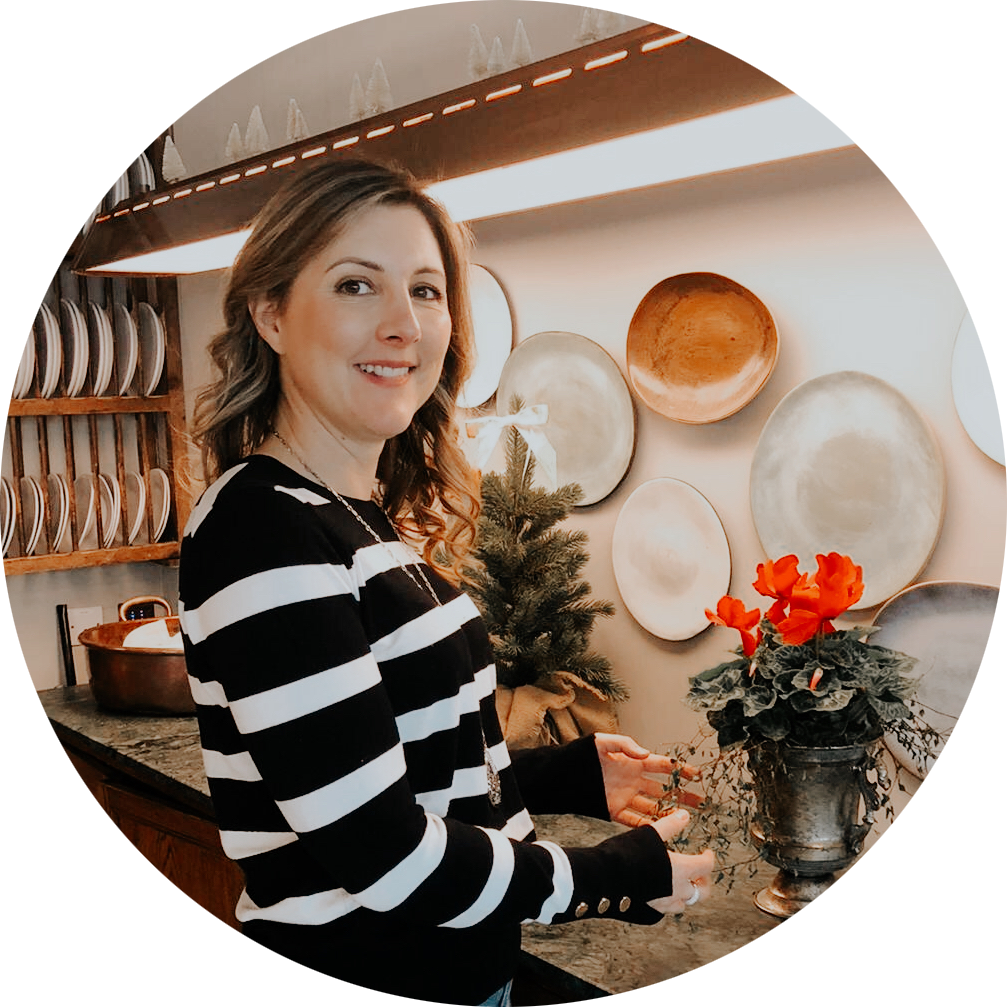
Hi, I’m Kate!
Holistic Health Coach & Nutritionist (MSc), fascinated by the planet, consciousness and the human condition. Healer. Earth, Music, Meditation Lover. Nourished by fresh food & gratitude.
Holistic Health Coach & Nutritionist (MSc), fascinated by the planet, consciousness and the human condition. Healer. Earth, Music, Meditation Lover. Nourished by fresh food & gratitude.

Website Branding and Visual Styling

Kate Carey Nutrition enables smart, driven, incredible women and men to live their best lives. Through 1:1 nutrition therapy consultations, private detoxes, 3 or 6 month health transformation programs and corporate wellbeing, Kate empowers her clients to food freedom and optimal health one bite, thought, step at a time.
This website acts as a doorway to those results. It is a space to learn how to nourish on all levels, to feel seen, heard and supported. Through minimalistic design, the intention of offering clarity and simplicity across all life areas is communicated: trimming the fat of overwhelm and overstimulation through loud fonts and colours and instead making it easy and inspiring to find an authentic direction in an otherwise chaotic world.
Monochromatic use of black, white and grey shoots straight - it keeps the foundation of the site clean, sleek and easy to navigate, for the overloaded superwomen and single-focussed men that want to scroll to the point pronto.
The emphasis of olive green immediately triggers an association with nature; a reminder of what our wellness is missing in this chaotic masculine paradigm — connection and respect for the feminine, the state of rest + receptivity in which all healing takes place.
“Nature does not hurry, yet everything is accomplished.”
This colour palette also invites a symbol of growth, is soothing to those wired women/men you are here to serve, and reconnects them back to a sense of feeling grounded, especially used in this neutral/pastel way.
I loved this from a design site I come across when researching:
“With the colour green’s association with renewal, growth, and hope, often green stands for both a lack of experience and need for growth. Green also stands for new growth and rebirth, common in the spring season when all of the plants are coming back to life with fresh growth and life after the cold winter months.”
I felt that captured the longing of your ideal client perfectly — directing to a total life transformation through the journey of working with you.
As per your brand clarity/project form, I’ve collected stock imagery that features relatable, engaging content to your ideal client: cooking, nutrition, thriving health, movement, mindfulness, family and greenery.
Fonts are modern and minimalist to emphasise the credibility of the information being presented and the ease with which it can be understood and absorbed.

Helping women feel their best, love their lives and bring their health into full bloom
I’m a Holistic Nutrition and Health Therapist, eating my way around London, studying all things well-being, and spending hours (upon hours!) in my kitchen inventing delicious healthy recipes, for close to a decade!